BioMosaic is a powerful online tool that helps track and assess the spread of infectious diseases. It integrates diverse datasets — such as weather, flight paths, mosquito and bird migration, and vaccination rates — to analyze disease vectors and predict future outbreaks.
One of the main design challenges was working with datasets in inconsistent formats, which required flexible interaction design and data visualization approaches.
As a Senior UX Designer, I led the user experience of BioMosaic, the company’s flagship product.
I collaborated closely with the data science team and our primary client, the CDC, to translate complex technical needs into intuitive workflows.
My work included interaction design for new features and UX improvements for existing modules — such as data upload, filtering, map customization, sharing analysis, and visualizing insights.
● Information Architecture
● Interaction Design
● Wireframes
● Data Visualization
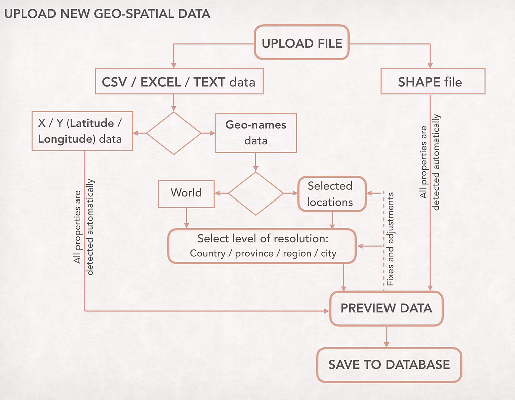
In the original workflow, users had to manually define many dataset parameters — a repetitive and time-consuming task.
I was curious how much of this process could be simplified or even made invisible. After several discussions with developers and data scientists, we identified parameters that could be set by default or automatically detected by the system.
This small shift had a big impact: it reduced cognitive load, saved time, and made the data-upload experience feel smoother and smarter. Once the workflow was validated, I translated the new logic into detailed wireframes and refined the interface layout to bring it to life.
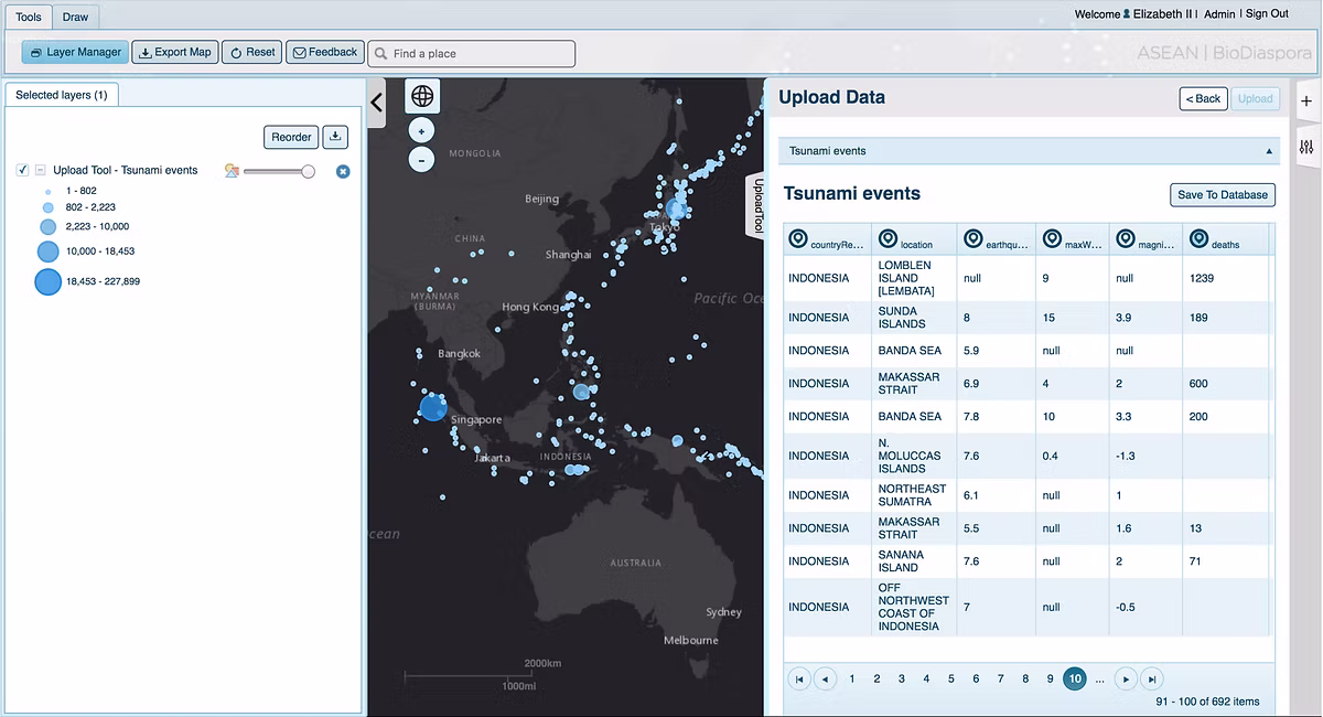
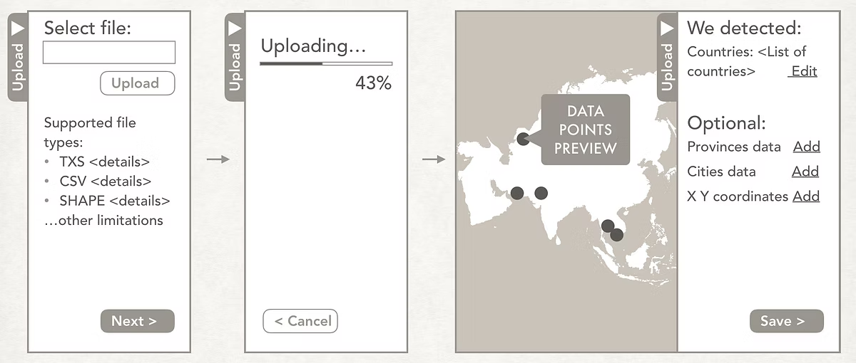
I redesigned the data upload workflow to replace a restrictive pop-up window with a dynamic side pane.
This new layout allowed users to minimize the panel and continue working while data uploading — especially helpful for users in regions with slower internet connections.
Several modules showed usability issues, so I conducted a heuristic evaluation, interviewed active users, and reviewed feedback from the support team to identify key pain points.
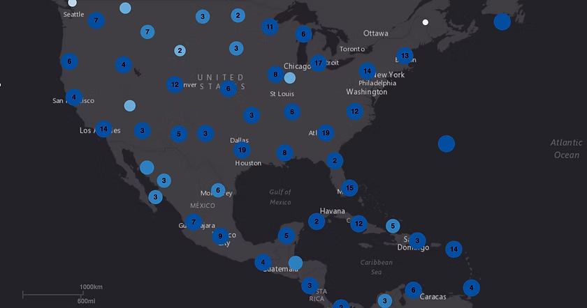
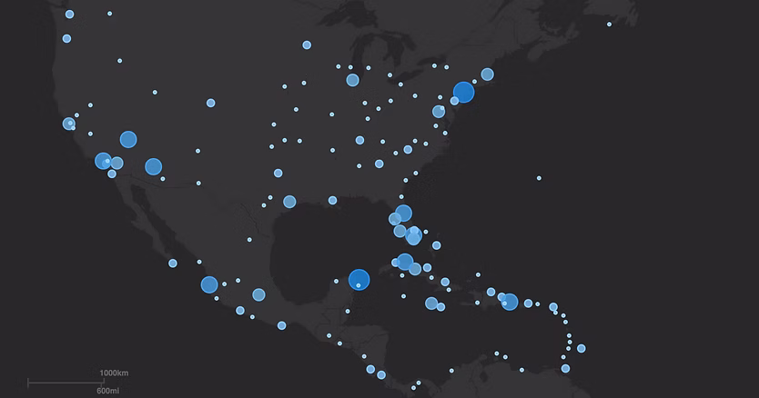
One major improvement involved how clustered data points were displayed. Initially, nearby points were automatically grouped into circles showing the number of items inside each cluster — a method that often confused users and led to misinterpretation. I proposed removing this aggregation and instead used transparency, outlines, and size adjustments to represent the true scale of each data point.
This redesign made patterns easier to spot, improved accuracy, and ensured accessibility compliance. In the updated visualization, the Florida region clearly shows a higher density of data points, allowing users to grasp insights at a glance.
In addition to improving existing workflows, I designed several new features to expand BioMosaic’s analytical capabilities. These included:
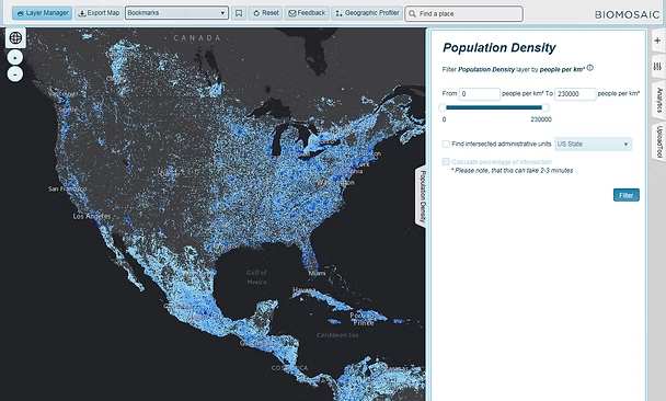
● Advanced filtering and data intersections: allowing users to combine raster and vector layers, such as displaying all U.S. Census tracts with a population density above 300 people per km² and an Aedes mosquito probability over 70%.
● Collaborative sharing: enabling users to share their analysis results with colleagues so others could review or continue the work.
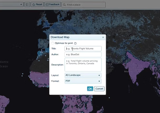
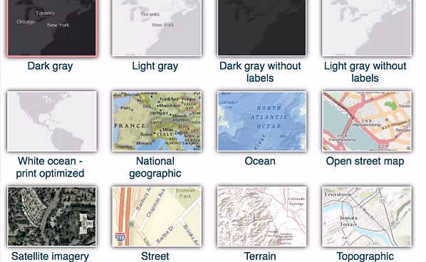
● Customizable visualization: giving users the ability to adjust map styles and data appearance for presentation or reporting purposes.These features made the platform more flexible, collaborative, and useful for both research and decision-making.
The new design reduced friction in critical workflows and allowed users to analyze uploaded data more efficiently and confidently.