Over three years, I helped transform OpsA, a big-data visualization and analytics platform, from a single-screen app with basic charts into a robust enterprise product used by Bank of America, GM, Vodafone, and others.
The platform integrates data from multiple sources — including log files, databases, and APIs — and offers unique analytical and visualization capabilities.
Watch the OpsA overview video
As part of the HPE Design Team, I was the sole UX designer dedicated to this project.
Working in a fast-paced, startup-style environment, I collaborated closely with data scientists, engineers, and early-adopter customers.
My focus was on translating complex analytical concepts into clear, actionable visual experiences.
● Data Visualization
● Interaction Design
● Information Design
● User Research
● Wireframes
● Usability Testing
● Concept Validation
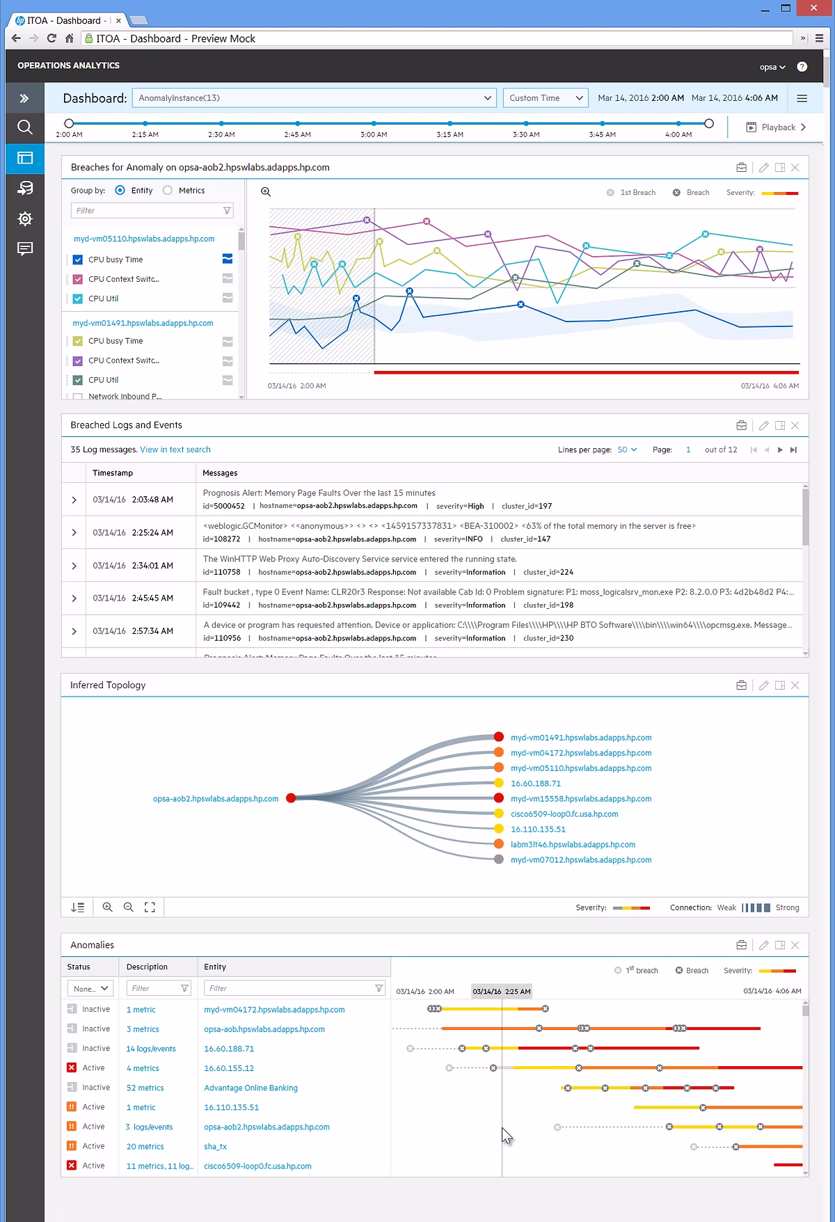
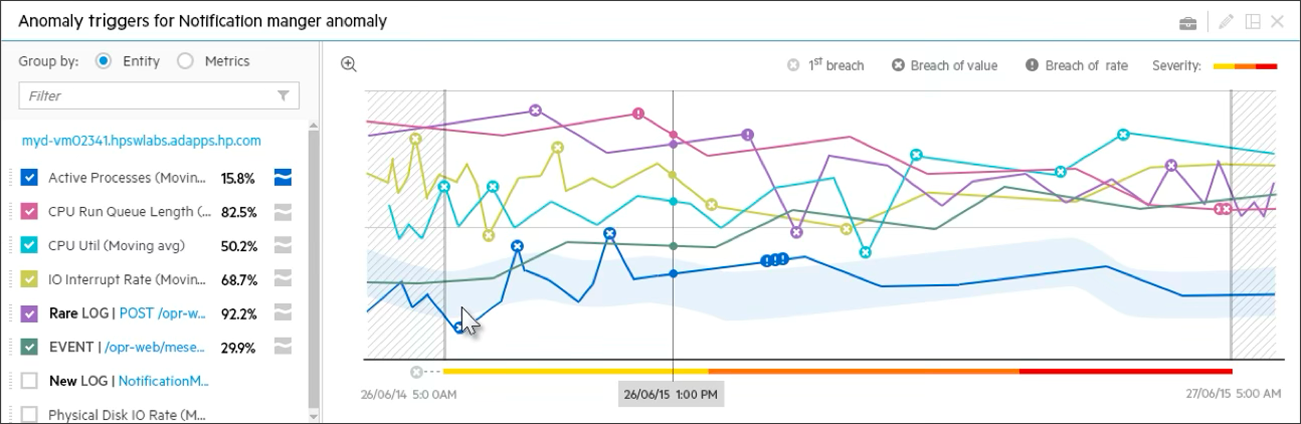
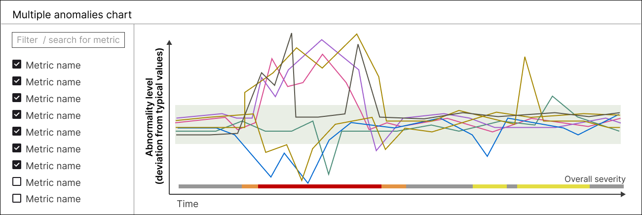
One challenge was helping users quickly spot anomalies in multi-series line charts.
In the first version, anomalies were shown as larger dots and a shaded “normal range” band. Although useful, it looked cluttered and didn’t express how severe each anomaly was.
To improve this, I introduced “deviation from normality” as the X-axis metric — normalizing seasonal and time-based variations (for example, predictable peaks in online purchases). This change made anomalies easier to interpret and compare across datasets.
The concept was validated through paper-prototype testing and later patented with two peers: US Patent 10,642,923.
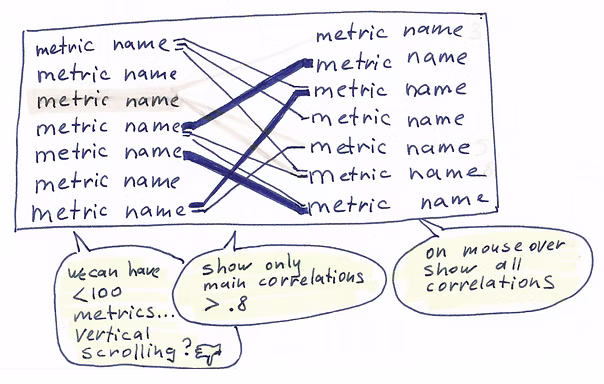
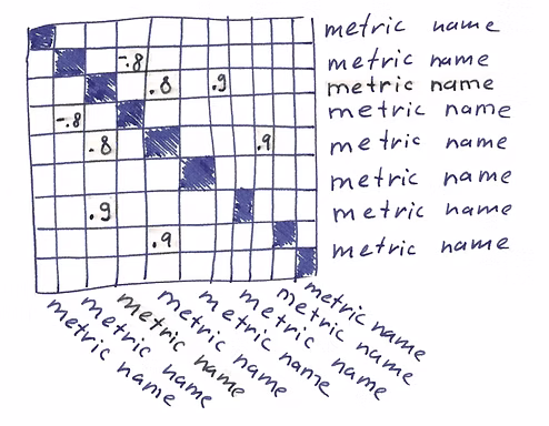
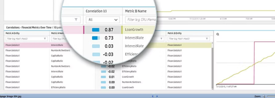
Another feature visualized correlations between pairs of time-series metrics.
Early sketches explored different layouts, but large datasets made many approaches impractical.
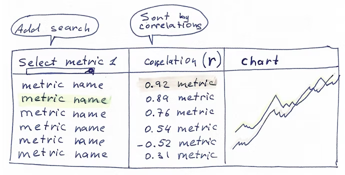
After iterative testing, I designed a scrollable, sortable table that displayed correlation strength (r = 0–1) alongside mini-charts for each metric pair. See the working prototype at 4:08 min in this demo video.
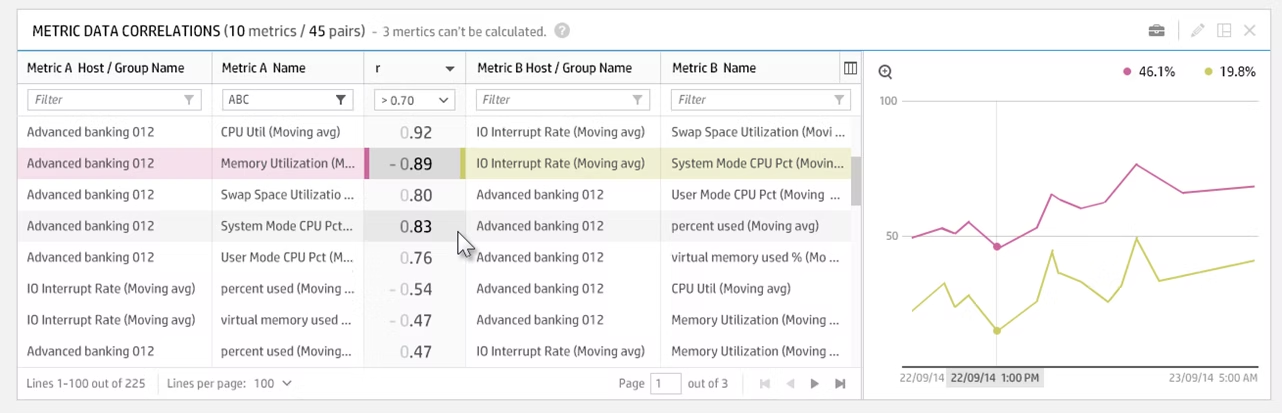
While running usability testing, I noticed users pausing to interpret the correlation strength — the numeric value alone didn’t convey meaning quickly enough.
I explored how to make this information more immediate and added a small bar indicator next to the number. This visual cue helped users grasp correlation strength at a glance, improving both speed and confidence in data interpretation.
I designed and tested the app across five major releases, all adopted successfully by enterprise clients.
The result was a scalable, high-performance analytics platform recognized for its usability and clarity in visualizing complex data.